
In keeping with my Christmas themed week of Daily Golden Nuggets, for today's website review I searched and searched for a retail jeweler located in a "Santa" related town or location. That task wasn't easy! I started by using Google Maps to search neighborhoods near this list of Santa named towns. Since all of the names on that list weren't really towns, I couldn't use my usual method of searching to find today's website review candidate.
My search eventually took me to Saint Nicholas, which is a neighborhood within Jacksonville, Florida.
I'm going to walk you through the specific steps of using Google maps to find a local business.
1. Opened Google maps and typed in "Saint Nicholas, Duval County, Florida" and was given this result:

(click to enlarge)
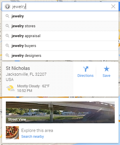
2. I clicked on the "Search nearby" link that you see in the above screen shot and started typing the word jewelry. You can see below how Google started to auto-suggest some answers:
3. I chose the "jewelry store" auto-suggestion and searched through the list for a jeweler that would be easy to drive to from that location pointer shown in step 1 above. This turned out to be Harby Jewelers shown here:
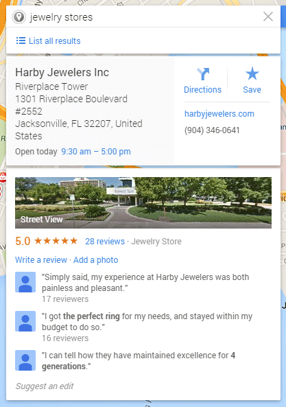
4. If I were an actual customer in that neighborhood I would then get directions to the store from my location as shown here:

(click to enlarge)
Here's the home page for Harby Jewelers:
http://www.harbyjewelers.com/
(click to enlarge)
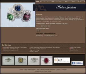
The first thing I notice is the older design. Down at the bottom, the copyright says 2005-2010. The design of the site reminds me of something from the late 2000s. According the Internet Archive (web.archive.org) this site was last updated on July 22, 2010.
I like that their holiday hours are posted on the home page; this is an indication that they are keeping their website updated even though it's an older design.
On the other hand, I don't like that they have 2 email addresses clearly visible on their home page. Having email addresses out in the open like that invites spam and email hacking from malicious automated systems. Most of that email hacking spam comes from China. Additionally, you are not allowed to have clear text emails on your website if you need to pass security testing for PCI-DDS Compliance.
They have 4 photos in the footer of their home page which are inviting to click on, but they are not clickable. If they did some usability testing, or even a simple heatmap analysis, they might discover that there's value of having those 4 images clickable to other landing pages in their site, or to the product detail page for each.
Heatmap testing usually reveals that people will click on photos with the largest contrast difference from the rest of a page. Since this site has a dark background, those white photos have a high potential to get clicked on. On the other hand, previous testing of my own shows that photos placed in a footer rarely get clicked on when the background is white.
Ultimately, every website needs its own type of usability testing.
Take a look at their product catalog page here:
http://www.harbyjewelers.com/Catalog.aspx
(Click to enlarge)
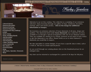
There's far too much text on the first page of their "catalog." The text explains the directions for using the catalog, how to use their diamond catalog, introduces their custom design service, and briefly mentions their return policy. That's a lot of topics to cover on this page in a boring text format, and it should all be replaced with beautiful products from their catalog because that's what customer expect to see when they click a "catalog" button.
All of their directions are necessary to have on the site, but only when the customer would expect to see them. The directions for using the diamond catalog should be on their loose diamond page, the custom designs should have an entire section devoted to it rather than a brief mention here. And the return policy should be accessible from the footer of the entire site.
I found their shopping cart to be quite cumbersome. After clicking the "Add to basket" button the items appear in a shopping cart on the left side of the screen. The color formatting made it difficult to easily understand what the user was supposed to do with that.
Here's what it looked like:
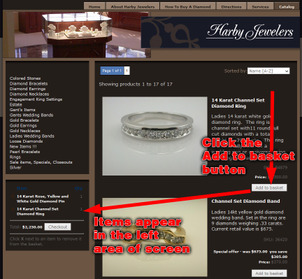
(click to enlarge)
Once you finish adding items to the cart and stepping through the checkout screens, this is the final payment page you will see:
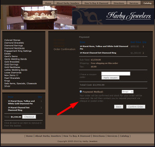
(click to enlarge)
Their payment methods are either "email" or "PayPal." People choosing the email payment method will be notified of the total cost along with a request for payment by check or money order.
Choosing PayPal will allow you to jump over to PayPal.com to pay the bill then be redirected back to the website. PayPal is a good alternative for online sales because it's easy to set up and it removes your website from being a credit card security risk.
Overall they need a lot of improvements on this site. A new product catalog should be set up using a better color scheme and layout. The shopping cart should also be upgraded to a more popular catalog version that won't confuse too many people, preferably a catalog version that has a lot of commonalities to shopping carts from other vary popular websites.
FTC Notice: I randomly choose this website and won't be telling the retailer jeweler that I'm doing a review. Unless someone else tells them, they will only find out about this review if they examine their Google Analytics and Google Webmaster Tools. I'm not doing this to solicit business from them, but rather as an educational exercise for everyone. This review is completely impartial and all my comments are listed in the order that I discovered them.


