In this edition of the Daily Golden Nugget, I'm giving you 3 more important mobile website design factors to complement the 3 mobile design factors I gave you last week.
These mobile recommendations come directly from Google, from this video.
Readable Font Without Zooming
Even if your website is designed to be mobile friendly, you still might me making a mistake with your font sizes. All of the text on your mobile website should be easy to read at a glance, without straining. That means you need to have the correct color contrast between your fonts and your background, and the font must be easy to read without pinch zooming.
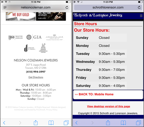
Take a look at these two mobile websites. Both screen shots show the associated store hours:

The mobile website on the left uses small, light gray text that you'd have to pinch zoom in order to see it. The mobile website on the right has large, dark gray text that's easy to read from an arm's length away.
This important because mobile websites need to be designed for single handed usage.
The mobile website on the left was a responsive design, while the one on the right was a dedicated mobile website. Responsive website designs always resize all their content to be proportional to the screen size, so small text on the desktop version of the site turns into even smaller text on the mobile version. Dedicated mobile sites can be fine tuned and tested for optimal usage without worrying about desktop users; that's not true of mobile users.
Clickability of All Links and Buttons
Every link and button on your mobile website must be easy to "tab" without the possibility of accidentally tapping the wrong thing.
Take a look at these two examples:

The mobile website shown on the left has very small links that are extremely difficult to tap without pinch zooming. On that website, you're more likely to tap the incorrect choice.
On the other hand, the mobile website shown on the right makes all their links look like buttons by using large areas of negative space and a different color background.
Not all of your mobile links need to look like buttons though, the links in your footer can be smaller, but you still need to consider the usability by people with larger fingers.
Avoid Interstitial Popups
Google really doesn't like interstitial popup windows that appear on mobile devices. They talked about them for a few minutes in their mobile usability video announcement (that link I gave you above).
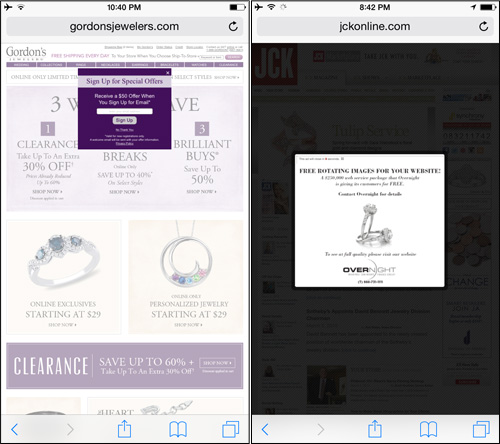
Some popup windows require a click to clear them, while others will dismiss after a few seconds. Here are two examples of this:

Neither of the websites in the above screen shot is mobile friendly. The popup windows you see are the same ones that you would see on a desktop computer.
The website on the left is gordonsjewelers.com. The purple box you see there is asking you to sign up to their email list. That interstitial popup won't go away unless you tap the "X" or the "No Thank You" link, both of which are very small and difficult to tap without extreme pinch zooming.
The website on the right is jckonline.com. Their desktop advertising program always shows an interstitial popup that clears itself after 10 seconds. It also has a small "X" on the top right corner of the popup, but it's very difficult to pinch zoom in to it.
Although I really don't want to pick on JCK, because I think they all do a great job, and I do speak at their events, I felt this was a good example that you might actually be aware of.
In both cases, Gordon's and JCK could set up a simple script that detects the device and then turn off the popup when a mobile device is detected.
Mobile Matters
A lot of SEO and online marketing blogs are talking about mobile compatibility since Google made their announcement on February 27, 2015. Although it has turned into a very hot topic, I really want to stress that this is not just hype. Over the next few months, I expect to be able to report on the traffic loss from websites that are not mobile friendly.
If your business lives and dies by the amount of traffic that visits your website, then what will happen when you lose 40% of the traffic once Google zaps you from organic mobile search results?


