Mobile websites are important, but a growing trend of mobile website design has me a little worried that websites are accidentally turning back the clock to a time of poor usability.
Splash Pages
The splash page was a very popular type of website home page design prior to 2010. A splash page was supposed to welcome a visitor to your site with a pretty image or an animation, and sometimes even music. Typically, there was a big arrow or the words "enter site" like you seen in this example:

Over time, these splash pages turned into a nuisance that you usually could not see on a smartphone and it forced an extra click. Websites with these splash pages are usually prone to higher bounce rates as well. Recognizing the higher bounce rates, Google started to show the second home page in search results instead of the splash page.
Resurgence of Splash
Every Friday, as I write my website review editions of these Daily Golden Nuggets, I am coming across more and more websites that are converting their designs from desktop focused sites to mobile focused sites. This seems logical since about 50% of website visitors is now coming from smartphones, except that there's too much focus on the minimalist design methods. The result is an accidental backwards step towards splash pages.
Here's one example:

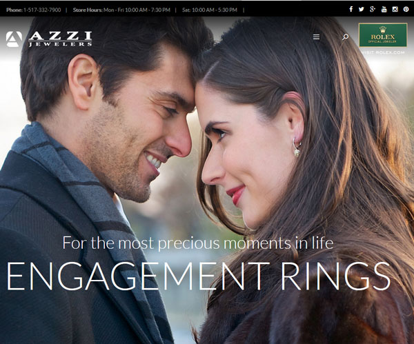
I took that screen shot from my desktop computer. Notice the 3-line icon (often referred to as a hamburger icon) on the top right near the Rolex logo. I shouldn't see that on my desktop computer, but yet when I resize my browser window I'm forced to use this website's mobile navigation. The website design has turned this into an accidental splash screen.
This next website design didn't even bother to consider how it would look on a desktop. On my desktop, I only see the Zinnia logo and the top of the model's hair:

This looks perfectly fine on a smartphone, but horrible on a desktop. Even though there are four easy to navigate links at the top, this home page is a complete waste of time for all visitors.
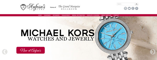
Then, of course there's the home page slider that's very popular now, shown here:

These sliders come in a variety of shapes and sizes. The one shown above was the full width of the browser window. Although these sliders are still bad for home page usability, they are not as bad as my first two examples because the main navigation always remains visible. However, the use of the slider still requires visitors to click something before finding more pertinent information on the website.
The Welcome Page
If you really want to provide a special message to new visitors of your site, you could create a "welcome page." I discovered that you could create a special page with the URL www.jewelrystore.com/welcome/ or www.jewelrystore.com/welcome.html and Google will use that page in many of your search results instead of your main home page. In fact, I've also found that, when space permits, Google will include both the home page and the welcome page in the search results, which offered added exposure and attention.
This welcome page is where you would include a message to first time visitors and some instructions on how to use the website. Unlike a home page that you should update on a regular basis, this welcome page doesn't need to be updated at all, especially since it's just an introduction of who you are and how to use the website.
The Future of Design
I expect the trend of large home page images and minimalist design will continue until business owners and website designers start listening to the website analysts who are currently pounding their head against the wall in frustration.
Those of us who analyze websites for a living are already well aware of how detrimental these large images, sliders, and minimal navigation are for home pages. They can lead to higher bounce rates and lower sales.
I respect the desire to have a home page that captures attention with stunning images, but most of the methods used in the last few years are no better than the splash pages of the past.
There's a lot of potential sales awaiting if you simply don't follow what everyone else is doing with these large home page images. You can prove it to yourself with some home page A/B testing. If the idea of A/B testing frightens you too much then talk to your website programmer, SEO agency, or usability expert.


