

Today is the Friday Review edition of the Daily Golden Nugget. The goal of this review is to analyze a website for its good qualities, and bad, and to learn from it. Every week I choose a location in the United States from which to pluck a review candidate from.
This week I'm heading over to Albany, Georgia. What I remember most about my own visits to Georgia is the unstoppable kudzu. But today I'm less concerned with vines that grow 1 foot per day because I'm in need of a quality jewelry store.
So I'm heading over to Google search and typing in "jewelry stores albany, ga" to look for one.
Here's the SERP:

The local results had three chain stores and three stores that didn't have websites. According to Google there are still 53% of small businesses in the US that don't have websites. I'm flabbergasted that the number is that high.
I usually skip the review of larger chain store websites because I want my readers to relate more to another small business website rather than a chain store that has a huge website budget.
So my only choice today is John Ross Jewelers and their website
http://www.john-ross-jewelers.com
That link I just gave you is for their home page, but for some reason, Google is linking the search results to http://www.john-ross-jewelers.com/selection/. I couldn't figure out why this is happening, but it seems odd.
This is the Selections page linked to from Google:
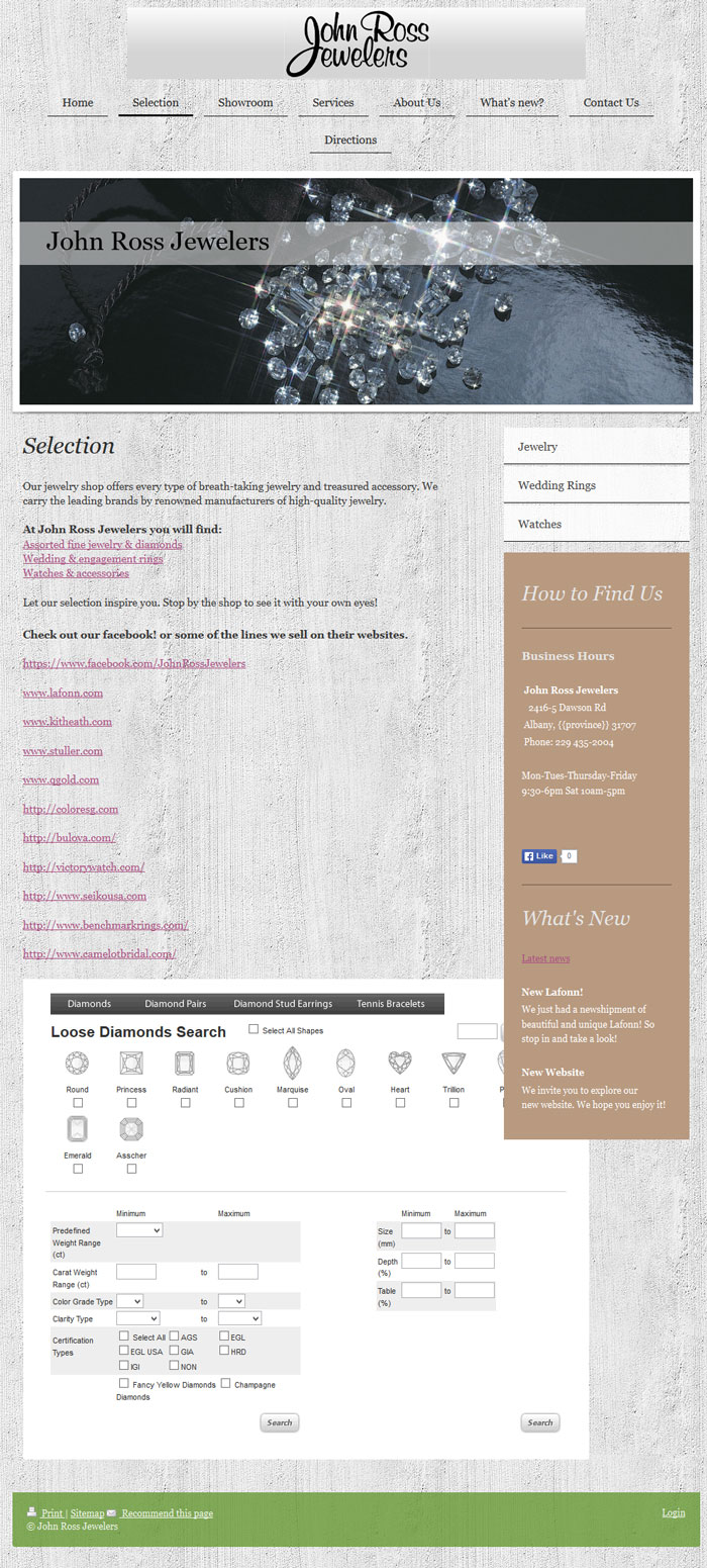
(click to view larger)
That page isn't very aesthetically pleasing; in fact, it is badly formatted with how that diamond search widget is inserted.
The home page shown here is much more interesting looking:
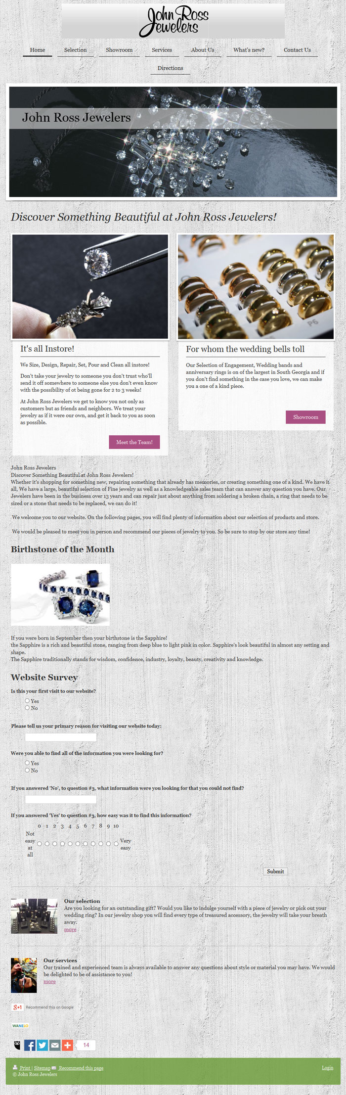
(click to view larger)
Overall, this website is the start of something good. This looks like the store's first attempt at a website, launched around May 2013. I am giving them some credit for putting this website together on their own even though it does have a lot of issues.
Here's a review of some of the things I noticed:
Top Menu is Wrapped
When viewing on a normal computer screen the link for Directions in the top menu drops down to a second line. Their website is responsive, and the top menu is supposed to change shape as the screen size gets smaller, but at full size, this should not wrap. It looks unprofessional.
Visual issues with their fonts
The general copy on their site is presented using the Georgia font with a pixel size and color that matches too closely with their background of stucco pattern. The headlines are easier to read in a larger font of the same color, or when placed against the solid beige background they sometimes use. But overall, I feel the site is difficult to read. They could fix this problem by lightening up the background or by placing all the content of their site on the beige background.
Off-site Links
I'd rather see dedicated pages within the website for individual designer lines than have a retail jeweler link to the designer's website. What I found especially troubling is that the landing page for Google, the Selections page, has 10 off-site links to designer websites. The links don't open into new tabs or windows, but just redirect the visitor away from the John Ross Jewelers website forever.
To fix this they should move all these designer links to a different page and make sure to change the HTML linking code so they forcibly open in a new window. This allows visitors to always find their way back to the John Ross website.
Good Use of Visuals
I appreciated their use of images throughout the website. For example, on their services page here:
http://www.john-ross-jewelers.com/services/
they included 6 photographs of the service they offer. Most retail jewelers just blab about their services without ever taking the time to show their work. Even a simple smartphone photo would improve the usefulness of the typical services page.
Their Address is Broken
Take a close look at this screen grab:

You see where it says {{province}}?
They've incorrectly set up their address in the content management system they're using. They signed up with 1&1 and used on of the built-in templates. The "{{province}}" is a database variable that should be filled in with either "GA" or "Georgia". I'm sure this is hurting their local search results in some way, and I'm sure this is a simple 2 minute fix.
Showroom is Cluttered
They don't have a product catalog online, but they did set up a "Showroom" page here:
http://www.john-ross-jewelers.com/showroom/
I found this to be overly cluttered and burdened by fancy widgets. They obviously took the time to include product photography on the website, but they would have a higher SEO value if they chopped this page into one page for each widget and included a written description to explain the collection of images.
What's Not So New
One of my website pet peeves are the "What's New" pages, because the "new" announcements are never removed. Many jewelers simply add the latest new information to the top of the page and push down the rest.
On this page here:
http://www.john-ross-jewelers.com/what-s-new/
you will find old announcements at the bottom, including the announcement for their "New Website."
A better approach would be to post the full details about your new announcements as blog entries to your blog. Once posted there, you could share some abbreviated details to your What's New page with a link back to the full blog post. With that approach, you would simply replace those abbreviated details every month with some new details and a new blog link. The blog serves as your long time archive.
In closing, I could have commented more on their design and their SEO, but as a first website attempt It's better to provide some guidance for the first round of improvements. This website is heading in the right directions, but it is taking them a little long to get it moving.
FTC Notice: I randomly choose this website and won't be telling the retailer jeweler that I'm doing a review. Unless someone else tells them, they will only find out about this review if they examine their Google Analytics and Google Webmaster Tools. I'm not doing this to solicit business from them, but rather as an educational exercise for everyone. This review is completely impartial and all my comments are listed in the order that I discovered them.

