
Welcome to the Friday retail jewelry website review. In this week's review, I'll be searching for a random website candidate to critique in the hopes that we can all learn something useful to implement on our own websites.
To start this week's review I started searching for jewelers in Hudson, NY. Specifically, I used the Google search query "jewelers in Hudson ny."
Here's a screen shot of what the Google SERP looked like:
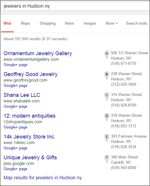
I'm going to choose Ornamentum Jewelry Gallery, the first jeweler on the list, without comparing any of the others.
Their website is:
http://www.ornamentumgallery.com/
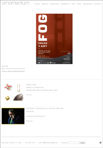
This is what it looked like when I first arrived:
(click to enlarge)
I felt very confused when I first landed on their website, and I had to go back to make sure where I was. The words "jewelry," "jeweler," and "jewelry store" are nowhere to be found on their website or in their navigation. The most prominent element on their home page is a snapshot of a "FOG" poster--FOG DESIGN + ART... Is this a jeweler or not?
If I feel disoriented, then I'm sure several other people did too. They should have written a description next to this graphic to explain that they were going to be at the Fog Fair. I'm writing this review on February 5, 2015, yet this fog event date says January 15-18, 2015. In other words, they don't update their website frequently enough.
A little further down on their home page, they still have an announcement for the December 3-7, 2014 Design Miami event. At least this event announcement has a "view more" link to read more about it.
I'd like to say that I'm not a font expert. I always have to ask other people for help when choosing font styles for a website, but I certainly am able to tell someone when they've made the wrong font choice, which Ornamentum did.
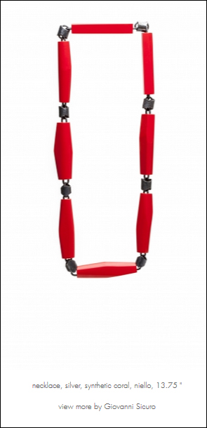
The Nielsen Norman Group says that reading on a computer screen is 25% slower than on paper, and this book explains that 80% of website readers only skim words. I had a rough time reading their website with the "Futura W01 Light" font they chose in their #666666 gray hex web color.
I dusted off my screen, looked at the site on my smartphone, and even cleaned my glasses just to make sure my eyes weren't playing tricking on me. It's just a terrible font to use in that color and at that font size. It takes considerable effort to read the words, let alone attempt to skim.
This is a complete design fail. Yes, the website looks clean and airy, but they did not give very much consideration to their website readers. This is probably the default font style that was in the files for the template they used, and they didn't test it after punching the content in to see how it worked.
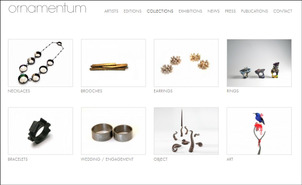
From the top menu, I clicked on the Collections page shown here:
(click to enlarge)
It certainly is a lightweight looking site, and that Futura W01 Light font is readable when used in all caps like they are here. The photography on their site is very well done. Although they have the ability to view a larger photo of every product, I wish I could zoom in a little more to see really fine detail for each one.
Here's a full size, high resolution screen grab from one of their product detail pages showing an example of their font choice.
Some Thoughts
Customers looking for a traditional jeweler will be confused by this website. Although the title of every page contains the phrase "contemporary jeweler," they truly are a jewelry gallery as their name says.
I don't think they are presenting themselves correctly for their target market. They are ranking in first place for "jewelers" when the employees list themselves as Directors, as in gallery directors or curators, on the Contact page. It's quite possible that Google index is confused about them too.
Obviously they are a high end jewelry store, but not what I expected to find when searching for a "jeweler."
Their website is missing an About Us page. I probably would not have been so confused at first if I had an about page to refer to. They chose to hide their "about" information on their contact page, which is not normal, and no one would quickly think to look there for it. Some businesses are self-conscious about their history being boring; that's something stores need to get over. You cannot hide your history; your potential customers will not assume you have one of particular reputation.
I don't believe in making website visitors think too hard. They bounce quickly when you make them confuse them quickly and make them think too much on your landing pages. To that end, I feel they should include at least include the word "Gallery" on their home page, or even better, "Jewelry Gallery" which clearly identifies what they are.
Overall, my recommendations would be:
1. Pick a better font
2. Include an About page in the top menu
3. Update their home page more often, at least to remove outdated information
4. Include the words Jewelry Gallery on their home page
5. Let me zoom in really close on the photos so I can see the fine craftsmanship
That's it for this week's review.
FTC Notice: I randomly choose this website and won't be telling the retailer jeweler that I'm doing a review. Unless someone else tells them, they will only find out about this review if they examine their Google Analytics and Google Webmaster Tools. I'm not doing this to solicit business from them, but rather as an educational exercise for everyone. This review is completely impartial and all my comments are listed in the order that I discovered them.


