
This is the Friday Website Review edition of the Daily Golden Nugget. Every week I search for a jewelry store in a random town and review their website. I never know how these are going to turn out, but they are always interesting as I examine website designs, functionality, SEO, and potential customer engagement.
Using Google Chrome in incognito mode to prevent personalized results, I searched for "jewelry appraisals Lafayette, IN." Here's the search results I saw:
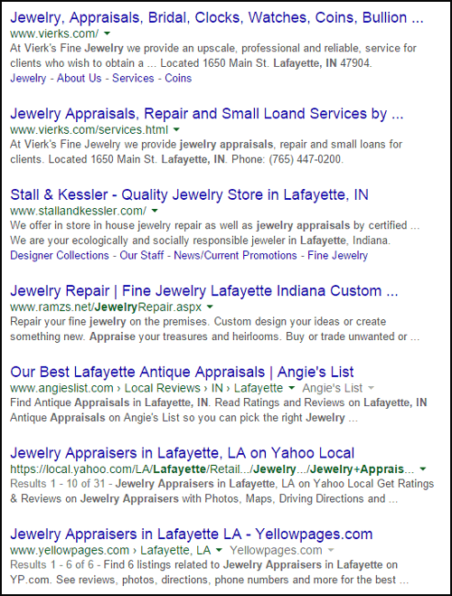
The top two results both have "jewelry appraisal" in the page title, and they are both from the same website. Google says they have taken strides to prevent the same website from appearing in search results twice, but it looks like that isn't the case here.
So off I go to the Vierk's Fine Jewelry website here:
http://vierks.com/
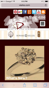
I noticed right away that their website is made with a responsive design, so let's take a look at how it reformats itself on different screen sizes.
This is what it looks like on a wide screen laptop:
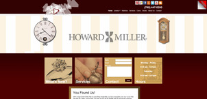
(click to enlarge)
This is what it looks like on a 19 inch desktop monitor:
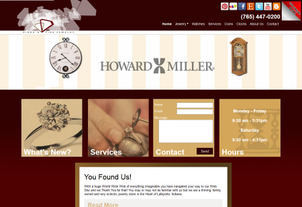
(click to enlarge)
This is what it looked like on an iPad:
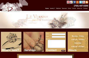
(click to enlarge)
And this is what it looked like on an iPhone:
(click to enlarge)
The Design
I have to admit that I do not like the way this website looks. I'm not fond of the color scheme at all with the red gradient background and the mustard color highlights throughout.
When choosing a color scheme for a website, I usually recommend that you match it to your store and your logo. It looks like their overlapping diamond logo uses a beige color and a brick red color. I couldn't find photos of their store on their site, so I sifted through their Facebook page until I found this one from December 2014:

In that photo, you can see how their color scheme carries through the store, but I can't say that it carried well to the website.
I also feel that the font size and spacing is a little too small. A few years ago, I would have said that this 13 pixel font size was completely fine (I used to use 12 pixel font sizes), but this looks small compared to the website design trends you see today.
Outdated and Cliché Feature
I have to point out the red "Girlfriend Alert!" that you can see in the top right corner of the widescreen version and the 19 inch versions of the website you see above.
This is what you see when hovering over it:
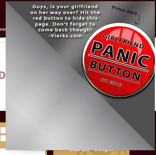
Years ago, I used to see this feature on many jewelry websites, but I feel the time has come to kill it. This really is an outdated cliché that a guy needs a hot link to a "safe" website to prevent suspicion. Personal website navigation, bookmarks, favorites, and browser settings allow for much faster and less suspicious ways to hide a jewelry website.
Additionally, this girlfriend alert is not friendly to same-sex couples who also need supportive businesses where they can buy their jewelry. While businesses in Indiana may feel extra pressure in that department, this store could make efforts that would soften the image that their home state of Indiana is currently experiencing.
Out of the Ordinary
When it comes time to set yourself apart from your competition, every little thing counts. Take, for example, the typical 30 day return policy that you often see on e-commerce websites. Instead of that boring 30 days, why not have 31 days, or 60 days, 90 days, or even 180 days? Any one of those numbers will stand out, and make your service more memorable.
Take a look at Vierk's store hours:
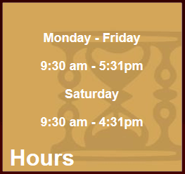
Do you see it? They close at Five Thirty-One PM and Four Thirty-One PM... 5:31pm and 4:31pm.
That extra minute isn't a lot, but I bet it could make a good conversation starter on social media. However, I didn't find a mention of it during a quick scan of their Facebook page.
Broken Links
It's never good to find any broken link on a website, and it's even worse when it's in the header of every page.
The top right corner of every page has all these social icons:

The icons remain static regardless what size screen you are using.
The last icon, the orange B, is supposed to link to their blog, but this is what you see when you click it:
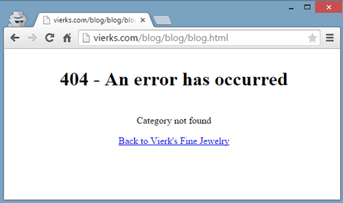
It links to this dead page on their website: http://vierks.com/blog/blog/blog.html
I figured out that it should be linking here instead: http://vierks.com/blog/
The 404 error you see in the above screen shot is the default message that their website is generating. It has, what appears to be, a convenient link "Back to Vierk's Fine Jewelry" home page. Except this is what you see when you click it:
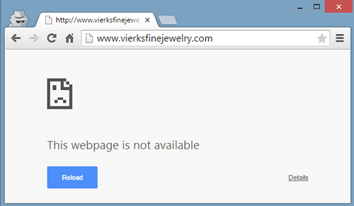
It looks like their web host incorrectly configured their server to direct lost website users back to vierksfinejewelry.com instead of the vierks.com domain that they are using.
This is pretty bad news for them because the 404 error page is one of the more popular pages on every website. It really is. You can read about effective ways to configure your 404 error page here, here, and here.
That's it for this week's review; see you next time...
FTC Notice: I randomly choose this website and won't be telling the retailer jeweler that I'm doing a review. Unless someone else tells them, they will only find out about this review if they examine their Google Analytics and Google Webmaster Tools. I'm not doing this to solicit business from them, but rather as an educational exercise for everyone. This review is completely impartial and all my comments are listed in the order that I discovered them.


