
Welcome to the Friday website review edition of the Daily Golden Nugget. The goal for today is to find and perform a usability review of a random jewelry store mobile website. I'm performing the review on, and taking screen shots with, my iPhone 6.
The first review for today is to see if a google.com search through the Safari web browser would yield the same results as a search using the Google search app on the iPhone. Here's a side by side comparison of the two methods:

(click to enlarge)
As you can see, all the results are the same between the search app and the Safari browser. But there are some differences with how the results display between them. Notice how the Google search app provides an option for quick directions and to call the store, but the Safari results only show the call option.
Because I've previously given the Google search app permission to track my location, the app is able to show the distances between me and those three stores. The google.com website through the Safari browser would have to ask permission to know my location, which it didn't.
The results on the Safari browser show the current store hours, yet that information is missing from the Google search app. That's a really critical point to be aware of. Store hour information is one of the top things that mobile visitors need to find, which is why you should always keep your store hours updated in your Google My Business account. However, seeing how these results appear here clearly shows why you also need to prominently display your store hours on your website.
The J&M Jewelry website is listed first in the organic results in both Safari and the search app, notice how it also says "Mobile-friendly" in both.
As a point of note, I have grown accustomed to using the Google search app for mobile searches. I switch over shortly after the introduction of the "okay Google" voice command feature. However, I'm not a fan of how the app opens web pages because the app functionality sometimes interferes with the mobile website functionality. After finding a result in the search app, I usually take the extra step to open the site in Safari.
In this case, I'm just going to tap the Safari result for J&M Jewelry and take a look. This is the screen shot of what I saw when tapping that result:
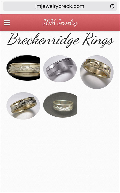
As a home page, this is pretty horrible. I assume all the website navigation is hidden within that 3 line icon on the top left, often called a hamburger menu icon. I'm a little disappointed that they are showing their Breckenridge Rings collection on their home page without any other store information.
I tapped on the menu icon to see what was inside:
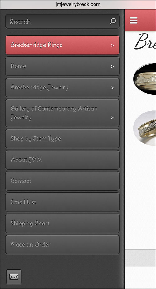
The size of the buttons shown in the above screen shot are large enough to tap with your thumb. Designing with thumb tapping in mind is very important because it allows people to use your website one handed, as in they can palm and grip the phone with 4 finders while navigating it with their thumb. The trick to making this work requires a lot of white space around "thumb tappable" elements.
Although the buttons are large enough, my personal preference would have been to make the button text a lighter shade of gray to increase contrast and therefore fast readability.
I tapped on the menu icon again to close it back up, then tapped on one of the ring images they had on their home page. Each one of them had a layout like this:

The website offered a way to directly purchase these rings after choosing the type of gold, ring size, and quantity. Tapping the Buy Now button brought me to this page:
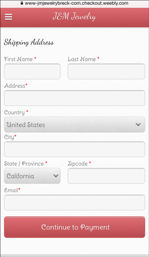
This is where I was able to discover that they were using the weebly.com website platform. Their mobile checkout feature is located at:
https://www-jmjewelrybreck-com.checkout.weebly.com/?view=mobile
I assume J&M is tracking shopping cart abandonments and capturing customer information, so I aborted this checkout because I didn't want to dig too deep into their customer tracking funnel. I opened the menu again and tapped on the button for Home.
That's when I realized the "Home" page link Google offered in the SERP shown above wasn't actually their home page, it was one of their special product category landing pages. This is their true home page:
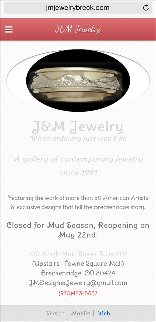
I don't know why Google is serving up the wrong page, or why the SERP says "J&M Jewelry - Home" as you can see above. I'd have to dissect this using my desktop, but right now, I'm sitting on an airplane typing on my iPad while looking at the website on the iPhone. I suspect either an incorrect page title or a strange redirect when first landing on the website. Either way, this needs to be corrected.
As for the home page, some of the text is too light of a gray color to quickly read on a bright white background.
Notice the message "Closed for Mud Season, Reopening on May 22nd."
I have to assume they forgot to take that message down on May 23rd since I'm writing this review on June 10, 2015. I'm not a fan of putting specific date announcements like this on the home page of a website unless you build in a way for the message to automatically hide itself.
This auto-hiding technique is possible with server side code, plug in website widgets, or even JavaScript. The point is that leaving outdated information like this on your home page creates a bad first impression of your business.
The home page doesn't provide a clear direction of where to go or what to do next. It also doesn't mention store hours. I opened the menu again and chose the button for "Shop by Item Type" to see this page:

This looks like the entry point for their full online product catalog. Once again, they correctly designed the navigation to be thumb friendly.
Tapping on "Pendants & Necklaces" brought me to this page:
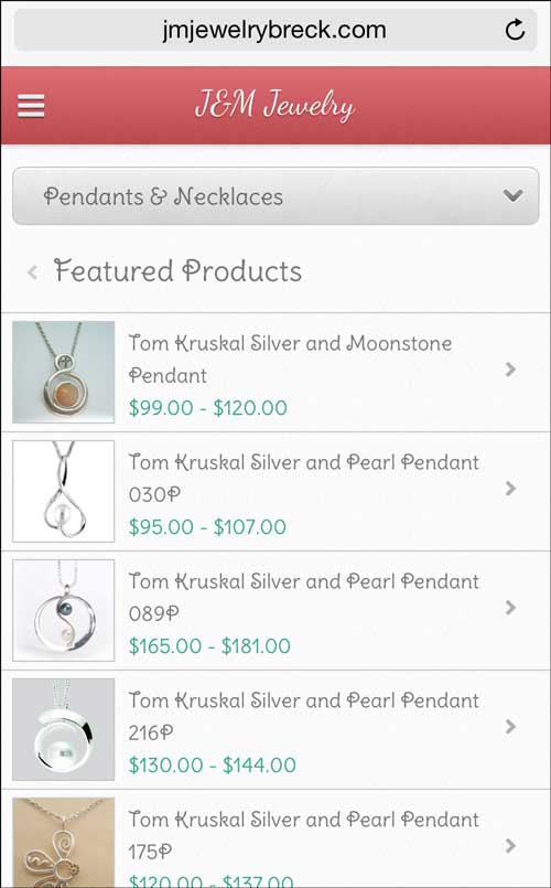
I feel the layout of this page continues the thumb friendly navigation, but the text seems a little small for fast reading when held at arm's distance away.
Continuing further, I tapped on the first item in the list, a Tom Kruskal moonstone pendant. Here's the product detail page:
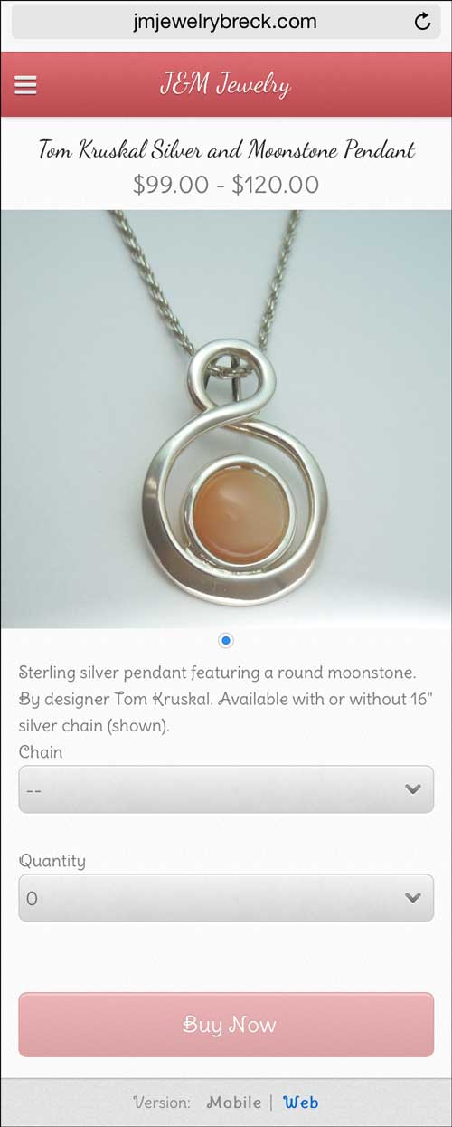
This is the same layout and purchase options as the ring I showed before.
At this point, I decided to test more of their menu navigation and found a bad usability flaw. Some of the buttons in the menu have a > symbol to indicate that they have submenu options. It's this submenu navigation that's flawed. Here's why...
You can drill down into submenu options, sub-submenu levels, and even sub-sub-submenu levels to reveal very specific product pages to view. The problem I found was that the menu wasn't intelligent to know what page you were on. Every time I chose a deep page within the navigation, I would have to remember where I was on my own to visit associated sub-submenu pages.
Here's how it looks visually:
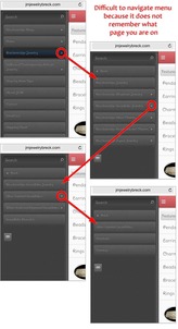
(click to enlarge)
A better designed menu would know what page you were on and it would provide some type of visual clue, but it would also reveal the correct submenu level when opened up each time.
Jumping out of their catalog, I next looked at their About J&M page as you see here:

It seems rather boring to look at; they should have included a few photos to accompany a few of their paragraphs.
I then tapped my way over to their Contact page as you see here:
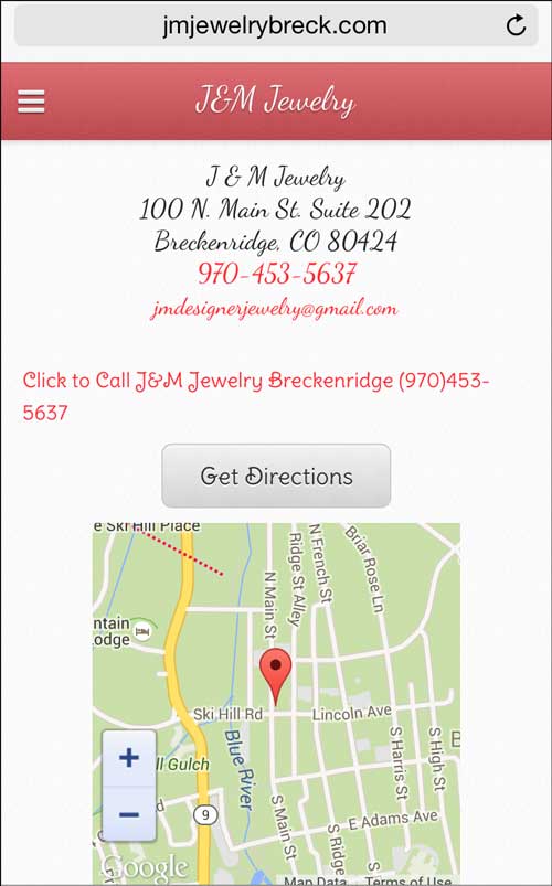
I feel the text on this page should be a little larger, again so it can be read from arms length away. I also don't like their script font choice for this page because it increases the time it takes for someone to read the address.
I do like that they have a Get Directions button that ties into Google Maps.
Lastly, I'd like to point out that they don't have their store hours listed on this Contact page. As I pointed out above, omitting them is a grave oversight.
FTC Notice: I randomly choose this website and won't be telling the retailer jeweler that I'm doing a review. Unless someone else tells them, they will only find out about this review if they examine their Google Analytics and Google Webmaster Tools. I'm not doing this to solicit business from them, but rather as an educational exercise for everyone. This review is completely impartial and all my comments are listed in the order that I discovered them.


