This is the Friday website review edition of the Daily Golden Nugget. The goal of these weekly reviews is to evaluate a random retail jeweler's website against website design methods, SEO strategies, usability, and technology trends. I use Google Chrome in incognito mode to find every review candidate with a basic local search phrase. I also try to capture my first impressions in these reviews and write them during my initial pass through the website.
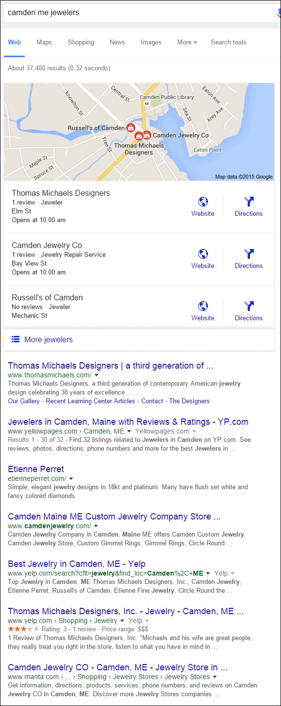
The local search phrase I'm using this week is "camden me jewelers." Here's the local search results that Google returned to me:

I'm choosing Thomas Michaels Designers as my review candidate since they are first in the Google Local pack and first in the organic results. Their website is:
http://www.thomasmichaels.com/
Home Page
Here's my first evaluation of their home page:

(click to enlarge)
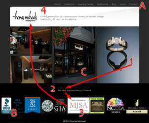
I've numbered the above screen shot to show how I first looked at the page...
1. I looked at the ring on the right with the reflection
2. I looked at the bright colored links below the main body area
3. Then the MJSA logo on the white background caught my eye
4. Followed by the logo on the white background at the top
What I just demonstrated was a conscious effort at tracking my own eye movements. What bothered me about their design is that the most prominent navigation appeared to be the Site Map, Privacy Policy, and the Contact links in the footer. I noticed those links before I noticed the primary navigation at the top, labeled as "A". To fix this they can simply move the footer links to the copyright location below the affiliation logos.
Speaking on the affiliation logos, labeled as "B", I feel they take a little too much attention away from the main focus of this site, which should be the photos in the center. They could solve this by making them darker, or by changing them to black and white. They could even had their color reappear with a mouse hover effect.
It wasn't until I started writing that I realized the center photo, labeled as "C", was in fact a photo of their storefront. Storefront photos should always correctly represent your store, because, naturally you want your customers to recognize your storefront when they are trying to find you. Dark photos like this certainly don't help.
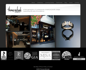
Putting this all together would make the home page look like this:

(click to enlarge)
Jewelry Collections Link
Of all the links at the top of their page, I was most interested in clicking on "Learning Center" and "Testimonials." I'm guessing that they would prefer me to click on "Collections" first, but that didn't capture my attention. Obviously they are a jewelry store, but nothing in their navigation says jewelry. Although it's obvious to us that "Collections" refers to the jewelry collections they carry, they shouldn't expect that the layperson understands that. They should change that link to say "Jewelry Collections."
Learning Center
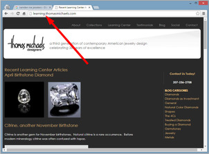
I was more than a little surprised to see where the Learning Center link brought me:

(click to enlarge)
The URL is http://learning.thomasmichaels.com/
This is a subdomain of their website. They should have set this up as www.thomasmichaels.com/learning instead. The difference is that Google views the subdomain as a completely different website whereas the directory "/learning" would be considered part of the website.
I have a full explanation of the nuanced difference between these configurations in this previous Nugget about sub-domain vs. sub-directory blogging. In short though, the reason you don't want to do this is because your subdomain websites will be competing with your main site.
Testimonial Page
The Testimonial page is way too long. I counted 25 testimonials of various lengths. While this might be good content for Google to read, it's only good for Google. No one will read all these testimonials on a single page. The better strategy would be to randomly position these around the website for people to stumble upon as they browse around.
I've included a very long screenshot of the Testimonial page below. They've wasted a lot of screen real estate with the empty right margin that's blank.

Blog
Once again, I was surprised to see that the blog section of their website took me to the subdomain website http://blog.thomasmichaels.com/. They've unwittingly created 3 different websites that will compete with one another in search results.
CMS Analysis
My final analysis step today was to investigate what content management system they were using. To my surprise they are using Drupal. Drupal is well known for the subdomain website misconfiguration I mentioned above with their "learning" and "blog" setup. The person who set up their website probably wasn't aware of this common SEO issue.
Conclusions
Based on my experience browsing their website, nothing compelled me to click into their "Collections" area. I briefly looked at it, and was disappointed by the lack of jewelry they had on display.
Their best course of action is to have someone review their design, usability, and help them better match their goals with the functionality of the website. My educated guess is that, at the time of this writing, their website isn't bringing them a lot of business.
FTC Notice: I randomly choose this website and won't be telling the retailer jeweler that I'm doing a review. Unless someone else tells them, they will only find out about this review if they examine their Google Analytics and Google Webmaster Tools. I'm not doing this to solicit business from them, but rather as an educational exercise for everyone. This review is completely impartial and all my comments are listed in the order that I discovered them.


