
Every week, normally on Friday, I write a website review with suggestions on how to make a random site better. I have something special planned for this Friday so I have to move my Flop-Fix review to today.
My purpose here is to find a website that has something wrong, point it out, and give suggestions on how to fix it. My suggestions are entirely my own and based on my past experience, research, or observations. I found my review candidate this week with the query "jewelry stores Happy Valley, OR" and these search results:
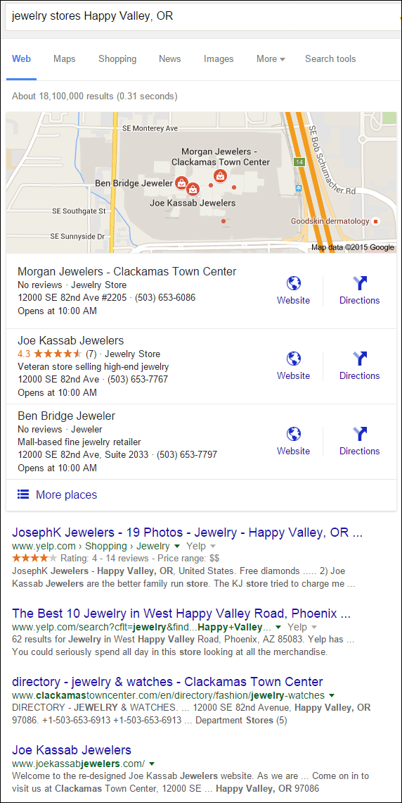
Within the local pack shown above, it was the 4.3 star rating that caught my eye first. It also turns out to be the only independent retail jeweler in the group. A quick look at the Joe Kassab Jewelers website and I knew they were the right candidate for this week.
The website is here:
http://www.joekassabjewelers.com/
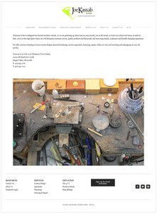
This is what the home page looked like when I first visited:
(click to enlarge)
First Reactions
I doubt that the general public knows what a jewelry repair bench looks like. Showing it on the home page, like you see above, seems a little out of place. It's a wide angle shot of a work space that people won't quickly recognize. Customers expect to see jewelry on a jewelry website, not a dingy and dirty looking tool bench.
Let's think about this from a marketing point of view. If a picture says 1000 words, what 1000 words are being conveyed here? Maybe they are trying to say that they repair jewelry, or is it that they custom design jewelry? There's no way to know what story they are saying. Without any context, this is a poor choice for a home page photo.
If their goal was to show their custom design expertise, then they could have used a collage of photos showing each step of the design process. If their goal was to show their repair expertise, then they could have shown a close up of a ring being repaired.
One thing to remember is that a wide angle photo gives the viewer too much opportunity to interpret what they are seeing in their own way, but a close up photo creates more interest and forces the viewer to see what you want them to see.
Large home page photos will often overshadow the words on the page, which is what happens on a desktop computer. But this is what you see on a smartphone:
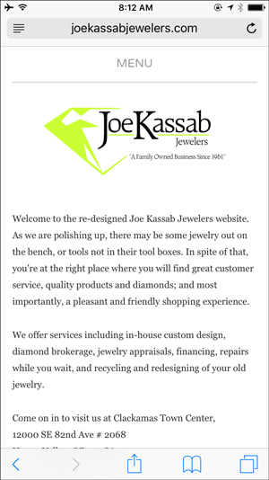
Now the focus is on the first two sentences here:
Welcome to the re-designed Joe Kassab Jewelers website. As we are polishing up, there may be some jewelry out on the bench, or tools not in their tool boxes. In spite of that, you're at the right place where you will find great customer service, quality products and diamonds; and most importantly, a pleasant and friendly shopping experience.
The web designer side of me is wondering if they are trying to be cute with that message. Maybe their website still under construction, or maybe they are just trying to amuse their website visitors. The bench photo is far less prominent on the smartphone, and the effectiveness of it, whatever it was, is completely lost.
Is it Broken, or Unfinished?
I like the way their top menu includes selections for "engagement rings" and "wedding & anniversary." Too many jewelers would incorrectly lump both of these into a "bridal" category. The word bridal is an industry term that should not be used on a consumer facing website. Kudos to them for organizing this correctly.
Under "Wedding & Anniversary" they have pages for Anniversary Bands, Eternity Bands, Plain Bands, and Men's Bands as shown here:
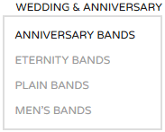
Sadly, every one of those pages are blank and look like this:
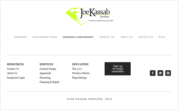
I now have to assume that the home page message was their tongue-in-cheek way of telling the visitor that their site is under construction.
You should never have blank pages visible on your website. They can be live while you work on building them, just don't make them visible on your main navigation. Blank pages will lead to disappointed or dissatisfied customers.
Mystery Date
Seeing those blank pages forced me to notice the footer of the website, and that it has a 2013 copyright. Since it's December 2015 as I write this, the old copyright and the blank pages make me feel like this website hasn't been updated in two years. Let's assume that someone searching for a jeweler during this time of the year is looking for a holiday gift. Seeing blank pages, an old copyright, and a home page under construction message tells me that I won't find anything of value online.
Even though this website has an easy-to-use, responsive design which would normally help a holiday shopper quickly locate jewelry gifts, they are more likely to become discouraged by the blank pages and outdated copyright.
However, I know that sometimes the copyright can be overlooked, so before I give up on a site I would check other pages, like the blog, to see when they last posted. Sadly, the only blog they have online is from October 24, 2013 as you can see here:
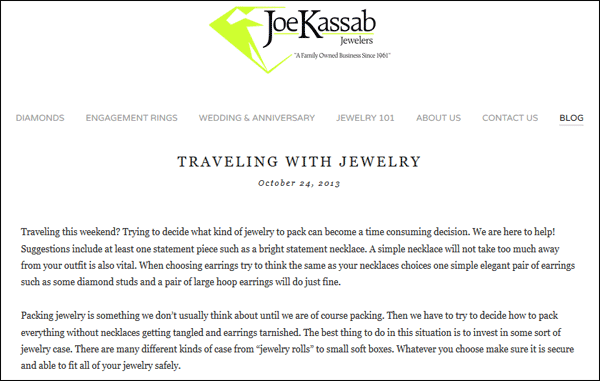
Blank pages, outdated copyright, and now an abandoned blog... These are all signs that the website hasn't been updated in a long time and it's not very useful for attracting new customers.
My final recommendations for this site are:
- Finish or hide those blank pages
- Program the copyright date to automatically update so you never worry about it again
- Hide the blog section of the site or start adding one new post per month
- Add more details to the site to explain the services provided in addition to the product catalogs
That's it for this flop fix review.
FTC Notice: I randomly choose this website and won't be telling the retailer jeweler that I'm giving them these flop fix ideas. Unless someone else tells them, they will only find out about this Nugget if they use Google Alerts or examine their Google Analytics and Google Search Console. I'm not doing this to solicit business from them, but rather as an educational exercise for everyone. This #FridayFlopFix is completely impartial and all my comments are based on previous experience in my website design and marketing agency, and from my personal research data.


