 Don't want to read? This week you can also watch the video recording of this review here!
This is the #FridayFlopFix website review edition of the Daily Golden Nugget. This week I've randomly chosen Santa Clarita, CA as the city to search for my review candidate. When I searched Google for the phrase "jewelers Santa Clarita, CA," I saw these three Google business listings:
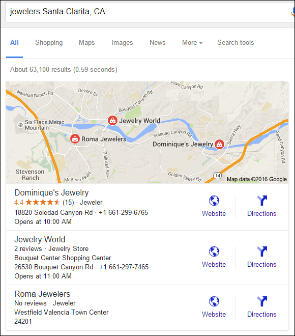
The goal of these reviews is to find a website that is flopping and make suggestions for fixes. It turns out that the first jeweler in the list is a good candidate for today. They are Dominique's Jewelry with the website:
http://www.dominiquesjewelry.com/
First Impressions
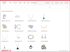
This is what their home page looked like when I first visited:
(click to enlarge)
It seems like I landed right inside a product catalog, but this is the home page. It does say "Wecome to Dominique's Jewelry" in small letters above the grid of products. By the way, that's not my typo, their website indeed says Wecome instead of Welcome. That's such an innocuous error, but it tells the visitor right away that you couldn't even double check your website.
I really felt lost as I looked at this home page. Initially, I thought I was looking at individual products in this table, but it's actually product categories. It took way too long for me to realize that these were categories. I can think of two potential ways to make this better. The first way would have been to include a header message clearly telling users to click on one of the categories below. The category images should also be much larger. The second way would be to drop them right into a product catalog and then offer a top menu or a left navigation that would clearly guide them to specific collections of products.
The first product thumbnail is labeled "Designer Jewelry (119)." The number 119 indicates how many products are available in that category. I find it odd that they have the numbers visible at the top level of their catalog. Normally I only see product count numbers like that when reductive product navigation is being used. Reductive navigations are used by large online retailers, like Zappos.com, where they allow you to select your product category and then apply refinements like size and color. As you make more refinements, you will see the product count drop. There simply isn't a reason for it here. My suggested fix is to remove those counts and make sure to automatically hide any category that has a zero count.
Website Design
Jewelers often tell me that they would like to have a simple, or open-looking website, but this one is too simple. The font size is too small, too. The company logo is a simple script font DJ in the top left corner, which I feel is too understated. Simply changing the size of my browser window reveals that this is a responsive website. Here's a screen shot when I changed the window width to about 600px wide:
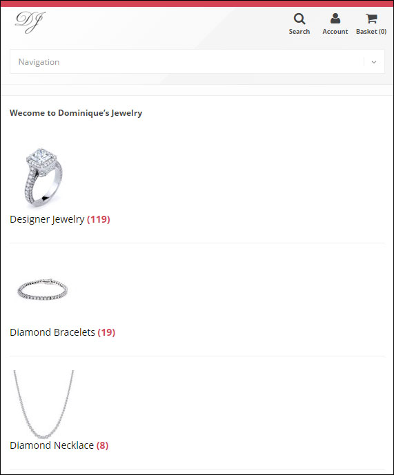
You can see how the top menu collapsed and the products now appear in a single column.
It looks to me like they planned for a mobile website first, without really paying attention to the aesthetics they lost on the desktop version of the site. They could change those thumbnails out for larger images and greatly improve the current aesthetics without even changing the design.
Product Images
When I finally dug into the product catalog, I was surprised by the quality of the photo of the first item I looked at. It was this garnet bracelet you see here:
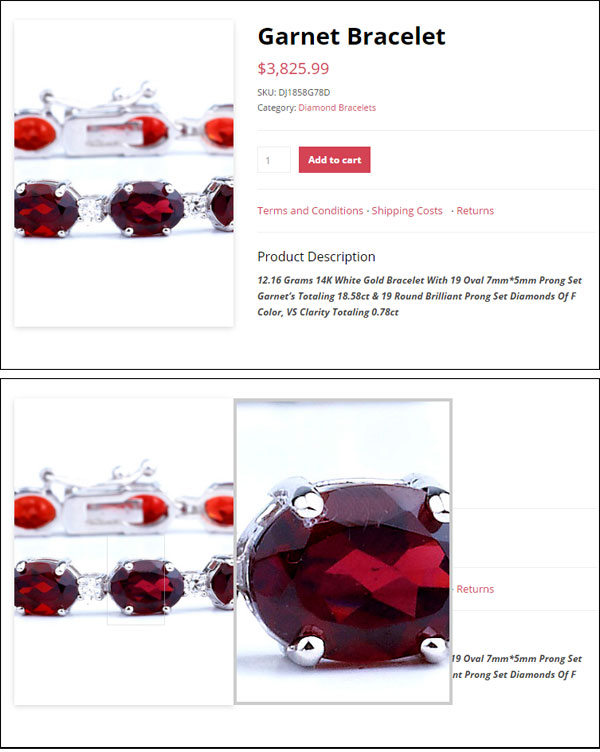
The top screen grab shows the product details and the bottom screen grab show the zoom of the photo. Because the thumbnails were so small, I didn't expect to see the level of detail in this zoom. However, even though the zoom is pretty high, the bracelet isn't completely in focus. I'm also a little confused by the difference between the thumbnail cropping on the browse page compared to the large image on the detail page. Look:
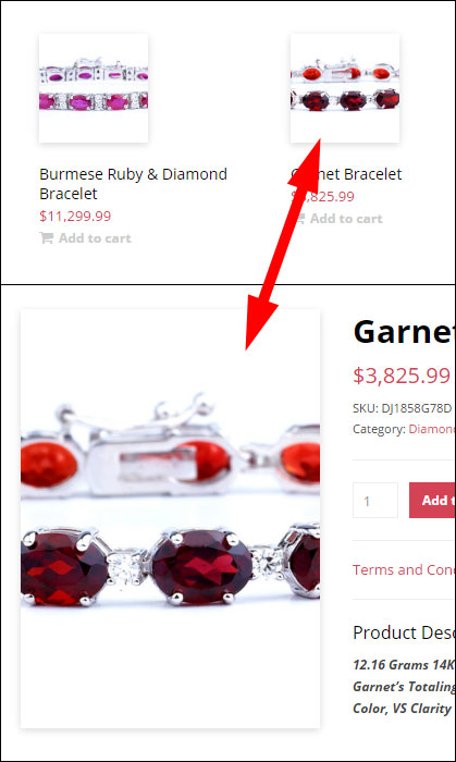
The thumbnail is cropped as a square, showing more of the bracelet while the main image on the detail page is horizontally tall, showing fewer garnet gemstones than what we see in the thumbnail. As I browsed around their site, I realized that many of the product pages had a specific format of showing a horizontally tall photo no matter what the original photo size was. It looks like they have an automated cropping happening on larger photos, but not all of their smaller photos like this one:
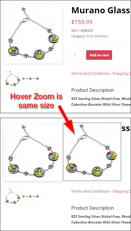
Here we see that the zoom feature shows the same size image, which isn't very helpful for a zoom.
They seem to have tried really hard to create consistency with their product images. I recognize their efforts, and I encourage them to continue working on their photography process. All the zoom images should be of the same size and revealing the same amount of detail, and they need to reevaluate how they are cropping these images, preferably to show more of the original image.
The Blog
Their first blog entry is from March 5, 2014 welcoming everyone to this new website. Then it looks like they started adding one blog post per week in the months of May, June, and July of 2014, then once in August and three times in November. That's when they stopped.
Here's a screen grab from their June 6, 2014 blog:
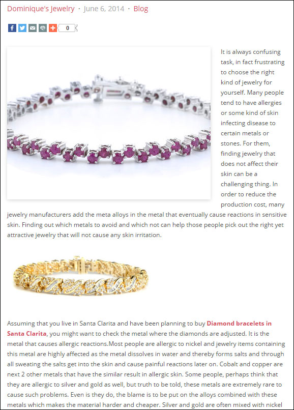
This blog post is very generic and reads as if it was written by a random freelance writer from fiverr.com who was just rewriting other information they found online. What I found interesting about this post was the use of their own product photography from their catalog; however, they missed the perfect opportunity to link those bracelet images to either the product detail page for each, or to the bracelets category.
If you look closely in the screen shot, you'll see the words "Diamond bracelets in Santa Clarita" in bold red. That is a link back to their blog, which is quite useless. Again the flop here is another missed opportunity. The fix is that they should have linked that phrase back to their diamond bracelet category of their catalog.
The only reason to write a blog is to help the search engines understand who you are, what service you provide, and what product you sell. The people who land on your blog might not actually read them, but they do look for quick reasons to click deeper into your site. Therefore, all the photos and links you include in a blog post should provide that ability to go deeper.
That's it for this week's review; I'll see you next time...
FTC Notice: I randomly choose this website and won't be telling the retailer jeweler that I'm giving them these flop fix ideas. Unless someone else tells them, they will only find out about this Nugget if they use Google Alerts or examine their Google Analytics and Google Search Console. I'm not doing this to solicit business from them, but rather as an educational exercise for everyone. This #FridayFlopFix is completely impartial and all my comments are based on previous experience in my website design and marketing agency, and from my personal research data.


