
Can you learn from someone else's mistakes? That's my hope, because I have a bunch of things to point out today as I vivisect today's retail jeweler website.
The search string I used today was "jewelers Tupelo, MS." Here are the results that Google returned:
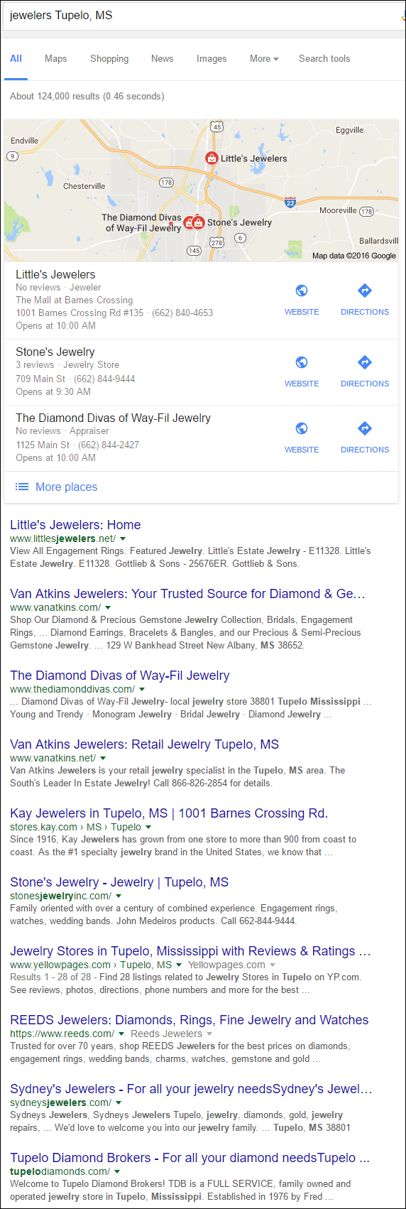
I'm on the hunt for a poorly developed website, one that we can learn something from. You can usually find those help-needing sites at the bottom of the first page list or at the top of the second page. This time I jumped down to the last entry, Tupelo Diamond Brokers. Their website was not very attractive, and there was a big GOB banner on the home page that you can see here:
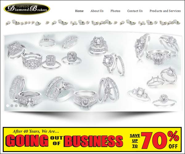
After a little more research, it seems like Diamond Brokers closed earlier this year. Their GOB sale was announced in November 2015 on the local news in Tupelo, but the website was never shut down. This retail store closing is a very familiar story; the owner had been running the place for a long time and it was time to retire.
Like many small businesses, retirement either means passing the business on to the next generation, selling it, or liquidating and closing up shop. More often than not, I hear that retail jewelers are holding liquidation sales because they can't sell the business. This is a pet peeve of mine because small businesses that have planned for retirement have the time to establish a strong financial position and sell the business instead of liquidating it.
Back to the topic of websites... Since TDB is out of business, I looked at the second jeweler from the bottom, Sydney's Jewelers and the website http://sydneysjewelers.com/.
First Impressions
This is what the website looked like on my desktop computer when I first visited:
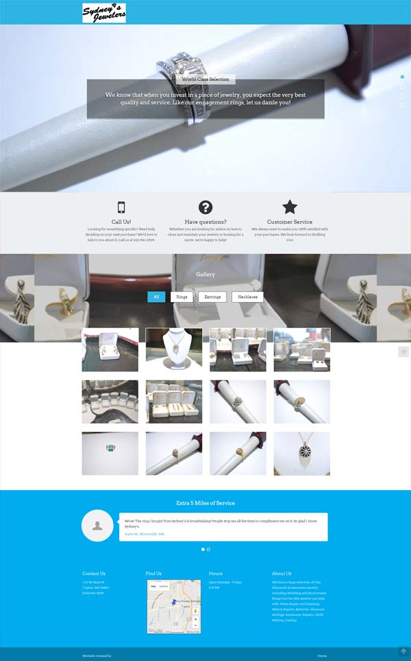
I wasn't very impressed at all with the large hero image, especially since it was blocked by their text box. Here's a close-up:

The engagement ring seemed unimpressive because the lighting is bad and it's a blurry photo. As the first thing you see on the page, I feel that this headline and subtext are pretty poorly chosen. It says:
World Class Selection
We know that when you invest in a piece of jewelry, you expect the very best quality and service. Like our engagement rings, let us dazzle you!
Everything about this seems disjointed and forced... "invest in jewelry... very best... like our engagement rings... dazzle you." It's difficult to read and even more difficult to say out loud.
I wanted to give Sydney's the benefit of the doubt; I might have been missing something. Right away, I also recognized that this was a responsive website design, so I jumped over to see what it would look like on my smartphone. This is what I saw:
(click to enlarge)
As you can see, the website converted into a very long page. There are animation effects that make the scrolling seem interesting. The mobile version of the site is also missing the headline and subtext I showed above.
Overall, the site looks better on a smartphone.
Poorly Chosen Words
I've already shown you the first clunky message and hero image at the top of their home page. Customers will judge you based on the first thing they see on your website. There were 3 more hero images and somewhat clunky headline/subtext messages that would probably give potential customers some pause.
The second hero image shows 10 rings and tries to compare their store to the "finest of retailers" as you see here:
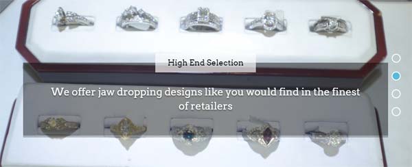
To me, this is a marketing faux pas. They claim to "offer jaw dropping designers like you would find in the finest of retailers." First of all, if they are a fine jewelry store, why are they immediately putting themselves down by saying "like you would find in the finest of retailers?" They should be equating themselves at the same level as other fine retailers, not using terminology of some outlet store.
Also, if they carry jaw-dropping designers, then why don't they include the names of those designers on the website? Nothing about the 10 rings shown in the above photo is dropping my jaw. It looks like the typical fine jewelry that has been around for a long time. I could be wrong, but it's hard to tell when the photography is poorly lit and out of focus. Photos like this do not inspire people to visit your store; they are more likely to lose you customers.
The third hero image on their site compares their service to big box stores as you see here:
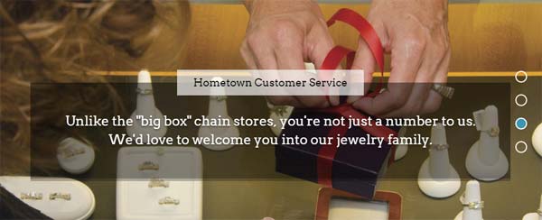
I do like the sentiment they are trying to convey here; I just don't like their approach. Hometown jewelers usually have better educated staff than a big box store, and the employees usually have more pride in their work. I get what they are trying to say, but they need to rewrite this without using "we" and "us," but rather, state this from the customer's point of view instead.
The last hero image talks about their in-house repair service:
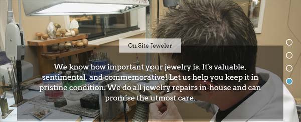
Of the four hero images, I like this one the most, but it's still clunky. It says they know how important the jewelry is, but then they hiccup when explaining that it will never leave their sight and it will be in safe care when they leave it for service.
Copywriters are so underrated.
Truthfully, what they need is a quality content writer to go through these messages and rewrite them all. The sentiments are there, but this seems poorly written without any regard to how a customer might react to them.
Product Gallery
Instead of setting up a product catalog on their website, the theme they chose allows them to include a photo gallery right on the home page. They've split this gallery into rings, earring, and necklaces. This is what it looks like:
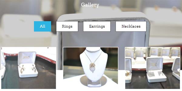
The images displayed on the page change when you click any of the buttons shown in the above image. The images fade and move around when you choose the different category options. That animation and movement is almost fun, but not enough to hide the fact that the photos are all horrible and that there's no information about any of the items shown.
The images invite you to click them when you hover over them like you see here:

However, the invitation to see a larger view is a complete lie. Instead of seeing a larger photo with more detail you are given this:
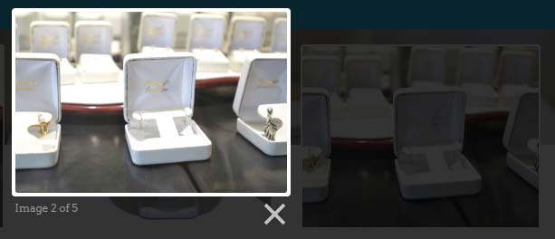
That's not a larger view; it's a wider angle shot of the same photo. Most likely the gallery photo is cropped using their CSS and this popup is the non-cropped version.
Without realizing it, they are disappointing the website users. They invite you to see more detail but disappoint you instead.
This gallery wouldn't be so bad if the photos were larger, the jewelry was in focus, and it actually showed real large images when I clicked on them. This is a complete fail the way it's setup now, and no amount of animation or special website theme effects will hide that fact.
Extra 5 Miles of What?
The bottom of their site says "Extra 5 Miles of Service." This is supposed to be their testimonials section. These are the two they have so far:
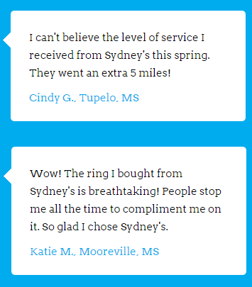
Is it just me, or do these sound fake?
Honestly, testimonials are usually never this well written, nor do they usually include the store name in them. Potential customers will judge you by the types of reviews they see online. Real reviews, even if they are not perfect, will carry a lot of weight, while reviews like what you see above will come across as manipulative and falsified.
I'd like to see every retail jeweler include some testimonials from customers. You should never rewrite them, but it is okay to correct punctuation and spelling. I'm even okay with poor grammar in customer testimonials because you find that on Yelp and Google reviews.
Infinity Page
I searched and searched but I didn't find any links to other pages of the website. This "home" page is actually their full website. That said, I did search Google for other hidden pages of their site and found several. It looks like they once had links to deeper gallery pages but removed those links from their home page. They're still online, though, orphaned from the rest of the site.
I've seen many 1-page sites in my internet career. They are usually specialized landing pages for a large marketing campaign; we also call them squeeze pages. Sydney's Jewelers single web page is currently ranked at the bottom of the first page of Google, but it could be so much better.
Their website is lacking a staff page, an about us page, and details about their services. With a little extra effort, and if they are willing to hire a copywriter, this could be much better. I also suggest creating a separate testimonials section of their website. Lastly, they should ditch the horrible product gallery on the home page and recreate a better gallery or catalog within their site.
Conclusions
A website is supposed to be helpful for your customers, but I don't think Sydney's knows this. The hero photos, headline blurbs, product photos, and even the testimonials at the bottom of the page all seem misleading or fabricated.
I assume the staff at Sydney's Jewelers is very nice and that the owner loves their work, but their entire online footprint is lacking. They don't update their Facebook account very often, the website needs work, and they haven't claimed their Google listing either.
The Sydney's website doesn't say who the owner is or provide any personal information about their staff. I have no idea what to expect when I arrive, and I don't know who would be helping me. According to Manta.com, the owner is Ronda Franks and that it was opened in 1977.
Unless Sydney's starts changing their way, I assume we'll also see a big red "Going out of Business" banner on their website as well.
This review was a little harsh, but I hope you learned something from it. That's it for this week; I'll see you next time...
FTC Notice: I randomly choose this website and won't be telling the retailer jeweler that I'm giving them these flop fix ideas. Unless someone else tells them, they will only find out about this Nugget if they use Google Alerts or examine their Google Analytics and Google Search Console. I'm not doing this to solicit business from them, but rather as an educational exercise for everyone. This #FridayFlopFix is completely impartial and all my comments are based on previous experience in my website design and marketing agency, and from my personal research data.


