For this week's website review, I'm revisiting a jeweler in Orlando that I reviewed in July 2014. Back then, I was searching for jewelers near the town of Christmas, in Orange County, Florida. According to my previous review here I had to use Google Maps to locate a nearby jeweler when searching for the phrase "jewelers in Christmas, Orange, Florida." Google certainly has made some advancement in their Google Local systems since then, because today the same search gave me this:
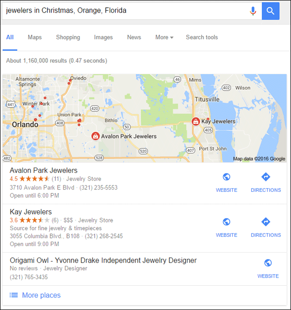
This time around, Google correctly identified the closest jeweler to Christmas, Avalon Park Jewelers and their website http://www.avalonparkjewelers.com/index.html
Lucky for Avalon Park, that Google is using a proximity result to show them in 1st place, because their website doesn't otherwise appear in the organic search results. They don't even appear in the search results for their town of Orlando, which tells me they have something wrong with their website.
Let's dive into this website and compare then and now, and perhaps make some guesses why they don't appear in the organic results.
Same Boring Cover
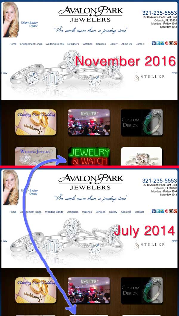
The home page hasn't changed except for adding the "Jewelry & Watch Repair" icon that you can see here:
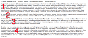
There's a lot of text on the bottom of the home page that you can see here:
(click to enlarge)
Paragraphs 2, 3, and 4 have not changed since 2014. The only thing that changed in paragraph 1 was the list of designer names. They are trying to explain their entire business in this section, but I feel that it is working against them. The text reads like a marriage of a sales pitch and keyword stuffing. If they were my client, I'd tell them to rewrite the entire thing because it's probably working against their Google ranking.
Site Speed Improvements
In my previous review, I specifically mentioned that their website was slow over my fiber optic connection. I'm happy to report that their website seemed extremely fast for me today. This is quite a refresher over the review from last week where I had to wait more than a minute for every page to load.
Sliders, Sliders, Still Everywhere
In the previous review, I pointed out that they were using the Nivo Slider on many of their pages. They are still doing this, and I feel it gets in the way. They even have the slider installed on some pages that only have one image, like this one:
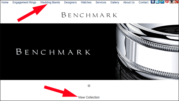
In the above screen grab I show one arrow pointing to the top menu and another pointing to the "View Collections" link. This is how their entire website is set up today, and that's how it was 2 years ago too. You have to click the first link from the drop down menu to get to the designer page, and then click the second link to view the collection. That's an annoying 2-step process.
What's more annoying, however, is the collection page as shown here:
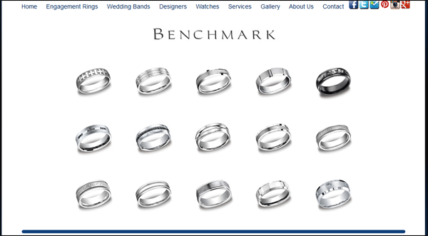
Each of the rings shown in the above screen grab are individual images, but they are not clickable. Other than those small images, Avalon Park doesn't offer any more detail about those rings. Are they silver, titanium, white gold, platinum, or some other metal? You'll never know unless you call them or visit the store in person.
This is the same setup they use for all the products they have on the website. This is not very usable for making purchase decisions, it's not friendly either, and it could be another reason that Google isn't ranking them highly. Since 2014, Google has been claiming that they are working on ways to better rank websites that are both friendly and provide information to help make decisions.
This Hurts My Eyes
One of the comments I made in July 2014 was that they were using the basic font "MS Sans Serif" in bold as their body copy with single line spacing. You can see it here:
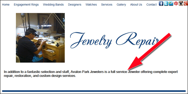
Their font usage is inconsistent throughout the site. Many pages are using the bold MS Sans Serif as shown above, but then there are a few using normal MS Sans Serif with center justification instead of left justification. They really don't have any consistency, which simply looks bad.
Just Gouge My Eyes Out Already!
In July 2014, I mentioned the link to the "Gallery" in their top menu. The page was blank back then, and, you guessed it, more than two years later is still blank. Here's a screen shot:
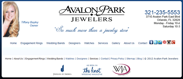
Does this blank page help any of their customers? I doubt it. This could be another reason Google isn't bothering to list them in search results.
Page Title Boredom
At this point, it's pretty clear to me that they rarely update their website; in fact, the only update I've found from 2 years ago was the slight changes on the home page.
They also haven't spent any time to update their SEO, specifically their page titles. Every page of their site has the same title, "Avalon Park Jewelers," which also isn't helpful. They should have a unique page title for every page that correctly describes what that page is about.
Socially Awkward
The top menu includes the 6 icons for Facebook, Twitter, Foursquare, Pinterest, Instagram, and Google+ as you can see here:
First, I'd like to point out that all 6 of these icons are out of date. Each company has changed their icons since 2014. You should keep up with these icon changes on your own website to maintain consistency with the social network's brand, but also to let your customers know that you actively share things to those networks.
Avalon Park updates their Facebook account at least every few days, which is what they were doing 2 years ago.
It also looks like they are using Twitter several times a week now too, which is a positive change from the barren account they had last time.
The Foursquare link they have is still broken, and they still haven't done anything with that account in all this time. They should just remove that icon from their website.
It looks like they have not updated their Pinterest page in a while. They had 104 pins in July 2014 and today they only have 125 pins. They would have thousands of pins if they were using this correctly.
I'm really surprised by their Instagram account. I last reported that they only had 2 photos, which hasn't changed. Instagram is gaining popularity among jewelry buyers and all jewelers and designers should be embracing it.
It's not surprising to me that they have not used their Google+ account since September 2014.
I recommend that they remove the icons for Pinterest, Foursquare, Google+, and Instagram since they are not using them. Don't invite your website users to visit your social accounts unless you update them often.
Conclusions
After 28 months, I'm a little surprised that Avalon Park Jewelers hasn't worked at all to improve their website. They could start with small steps, like changing their page title, and it would probably give them an immediate boost in their Google ranking.
I also have to assume that they do not search for their own business name online, because these reviews are pretty easy to find in Google search results. My hope is that everyone reading this will learn something, but the best benefit is for the actual jeweler I'm reviewing.
Tiffany Bayley, the owner of Avalon Park Jewelers, should consider a full website revamp, and perhaps hire some help for those social media accounts.
That's it for this week; I'll see you next time...
FTC Notice: I randomly choose this website and won't be telling the retailer jeweler that I'm giving them these flop fix ideas. Unless someone else tells them, they will only find out about this Nugget if they use Google Alerts or examine their Google Analytics and Google Search Console. I'm not doing this to solicit business from them, but rather as an educational exercise for everyone. This #FridayFlopFix is completely impartial and all my comments are based on previous experience in my website design and marketing agency, and from my personal research data.


